2 Intro to Modeling
2.1 Pre-step: Load Packages
library(readr)## Warning: package 'readr' was built under R version 4.2.3library(ggplot2)## Warning: package 'ggplot2' was built under R version 4.2.3library(dplyr)## Warning: package 'dplyr' was built under R version 4.2.3##
## Attaching package: 'dplyr'## The following objects are masked from 'package:stats':
##
## filter, lag## The following objects are masked from 'package:base':
##
## intersect, setdiff, setequal, union2.2 Getting Started
If you haven’t already, open (File > Open Project) the RStudio project we started in the last class.
Upload, and then open, the “02_Modeling_Intro” Markdown file.
We will continue to work with data from the Stat 113 First day survey, so insert an R chunk to read it in (don’t forget to load the
readrlibrary). For today’s class we are interested in the TV variable.
stat113 <- read_csv("data/stat113.csv")## Rows: 131 Columns: 25
## ── Column specification ────────────────────────────────────────────────────────
## Delimiter: ","
## chr (10): Gender, Smoke, Hand, Greek, Sport, Award, Tattoo, Twitter, Compute...
## dbl (15): Year, Hgt, Wgt, Sibs, Birth, MathSAT, VerbalSAT, GPA, Exercise, TV...
##
## ℹ Use `spec()` to retrieve the full column specification for this data.
## ℹ Specify the column types or set `show_col_types = FALSE` to quiet this message.- Insert an R chunk to load the
ggplot2library. (Note: As we get better at anticipating what code we will need for our analyses, we will usually place an R chunk at the top of the document to load all libraries we will need at once.)
2.3 Introduction to Statistical Models
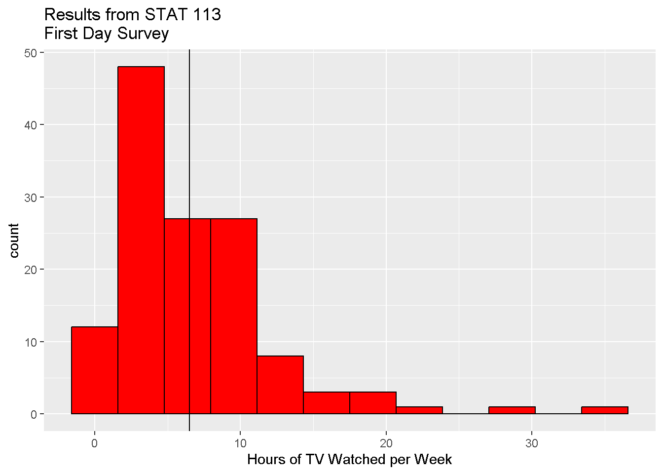
- Make a colored histogram of the TV variable. Change the title and x-axis label on the figure.
ggplot(data = stat113,
       mapping = aes(x = TV)

       ) +
  geom_histogram(bins = 12, fill = 'red', color = 'black') +
  labs(x = "Hours of TV Watched per Week",
       title = "Results from STAT 113\nFirst Day Survey")
- Choose: Write out the “constant” model for the amount of TV watched per week.
\(TV = \mu + \epsilon\)
- Fit: Estimate the mean amount of TV watched per week. (ggplot bonus! Add a vertical line that represents the mean to the histogram.)
mean(stat113$TV)## [1] 6.519084ggplot(data = stat113,
mapping = aes(x = TV)
) +
geom_histogram(bins = 12,
fill = 'red',
color = 'black') +
labs(x = "Hours of TV Watched per Week",
title = "Results from STAT 113\nFirst Day Survey") +
geom_vline(xintercept = mean(stat113$TV))
Use (and Assess): Use the model to predict the amount of TV you watch per week. Use it to predict the amount of TV your neighbor watches per week. How do these compare? How far off are these predictions?
Choose Again: Can we find a better model? What other variables (in this survey or not) might help improve predictions made from the model?
Choose Again: Suppose we suspect that a person’s sport status could be a potential predictor of the amount of TV they watch per week. Define a new model that allows for different expected TV amounts for athletes and non-athletes.
Fit: Estimate the new model parameters.
library(dplyr)
stat113 %>%
  group_by( Sport  ) %>%
  summarize( mean( TV ) )
## # A tibble: 2 × 2
## Sport `mean(TV)`
## <chr> <dbl>
## 1 No 6.23
## 2 Yes 7- Assess: Is this model an improvement over the old model? How might we formally determine this?
t.test(TV ~ Sport, data = stat113)##
## Welch Two Sample t-test
##
## data: TV by Sport
## t = -0.78049, df = 102.21, p-value = 0.4369
## alternative hypothesis: true difference in means between group No and group Yes is not equal to 0
## 95 percent confidence interval:
## -2.720747 1.184162
## sample estimates:
## mean in group No mean in group Yes
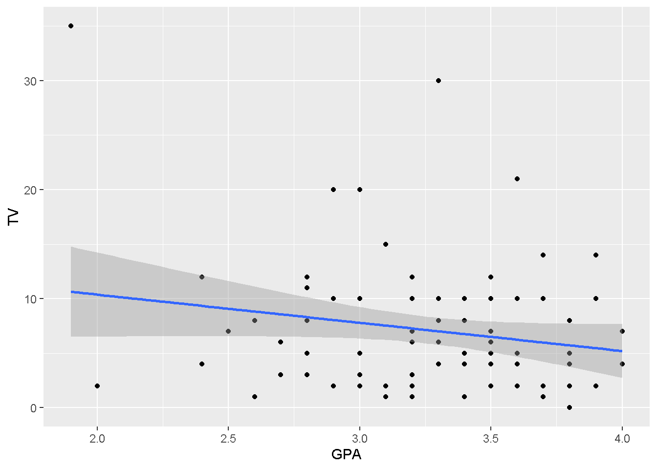
## 6.231707 7.000000- Choose Again: How might we modify the model to use a person’s GPA as the predictor instead of their sport status?
Hint: Let’s first think about what type of plot might be useful to examine if there could be a relationship between GPA and time spent watching TV.
ggplot(data = stat113,
       mapping = aes(x = GPA, y = TV)
         ) +
  geom_point() +
  geom_smooth(method = "lm")
## `geom_smooth()` using formula = 'y ~ x'## Warning: Removed 41 rows containing non-finite values (`stat_smooth()`).## Warning: Removed 41 rows containing missing values (`geom_point()`). Fit a linear (regression) model
tv_lmod <- lm(TV ~ GPA, data = stat113)
summary(tv_lmod)
##
## Call:
## lm(formula = TV ~ GPA, data = stat113)
##
## Residuals:
## Min 1Q Median 3Q Max
## -8.384 -4.182 -1.393 2.711 24.358
##
## Coefficients:
## Estimate Std. Error t value Pr(>|t|)
## (Intercept) 15.556 4.796 3.243 0.00167 **
## GPA -2.586 1.457 -1.775 0.07929 .
## ---
## Signif. codes: 0 '***' 0.001 '**' 0.01 '*' 0.05 '.' 0.1 ' ' 1
##
## Residual standard error: 5.874 on 88 degrees of freedom
## (41 observations deleted due to missingness)
## Multiple R-squared: 0.03458, Adjusted R-squared: 0.02361
## F-statistic: 3.152 on 1 and 88 DF, p-value: 0.07929When we are done for the day, save your R Markdown file and close your R project to save it (say “Save” when asked)